design: Carlotta de Bevilacqua, Laura Pessoni
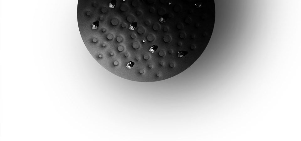
Silent Field works on three different local and space perception levels:
luminous: light defines the physical space by modulating relations between light and shadow and characterizing them through the control of white light colour temperature (3000 K or 4000 K)
perceptive: the selected colours arouse a sensation of harmony, while working according to the principle of subtractive synthesis and the contrast theory.
acoustic: ambient quality creates relational isles. The product does not invade space, but rather interprets it through silent distribution across it.
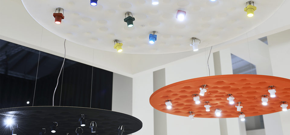
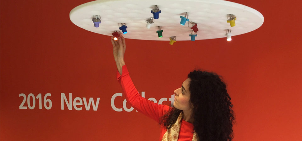
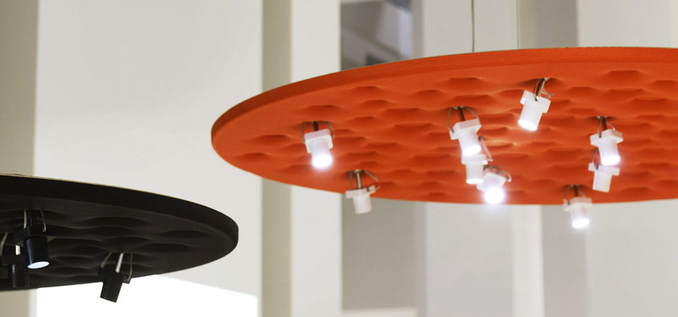
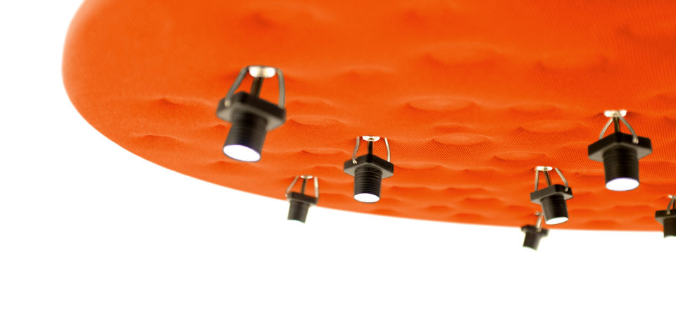
A sound-absorbing surface supports 12 adjustable LED units: this patented system ensures maximum light management flexibility via small spotlights (35 mm high, 25 mm diameter), which are connected to the surface by means of a spherical junction and allow 30° adjustment of the beam. With this solution, even and comfortable illuminance can be obtained across a 1 m2 surface, thus defining local perception supported by sound control.
Sound control properties are ensured by the geometry and by the varying density of the material used for the panel.
Like a moon crater, the product’s surface is characterized by several round three-dimensional hollows of different depths that produce a graphic pattern. Their geometry and their varying densities ensure broad-spectrum sound absorption of the reverberating frequencies typical of human voice. Low frequencies are best absorbed where the material’s thickness is greater and vice versa.
Moreover, the non-flat geometry of the surface produces a break in the wave: the hollow crater-like shape captures sounds that are repeatedly reprocessed, thus maximizing absorption. The graphic geometry of the different densities defines a fractal pattern: it is a natural, dynamic, and seemingly unbalanced geometric model that has a positive impact on our unconsciousness.
Lastly, the selected colours reflect simultaneous contrast theories and investigate visual perception principles in the combination of primary and secondary shades. This relation is reflected in the combination between broad surfaces in primary colours (white, black, and red-orange) each time strewn with neutral, monochrome, or multi-coloured elements. It is a multi-purpose product suited for all living and working spaces, both public and private, which allows to rediscover and redesign space through light and through proxemic relations, while creating spaces capable to arouse a sense of belonging via a combination of simple elements.
